COVID-19 Testing Trends Tracker
INTERACTIVE / DATA VISUALIZATION
Designed at Graphicacy for Johns Hopkins University's Coronavirus Resource Center.
Johns Hopkins came to Graphicacy to assist in making these particular COVID-19 visualizations easy for the general public to understand: trends in how COVID is increasing or decreasing in any particular state in relation to key indicators set by the White House as benchmarks for reopening. Our team was intent on creating engaging interactives, while allowing users to quickly understand the trends in the data and the context of those trends.
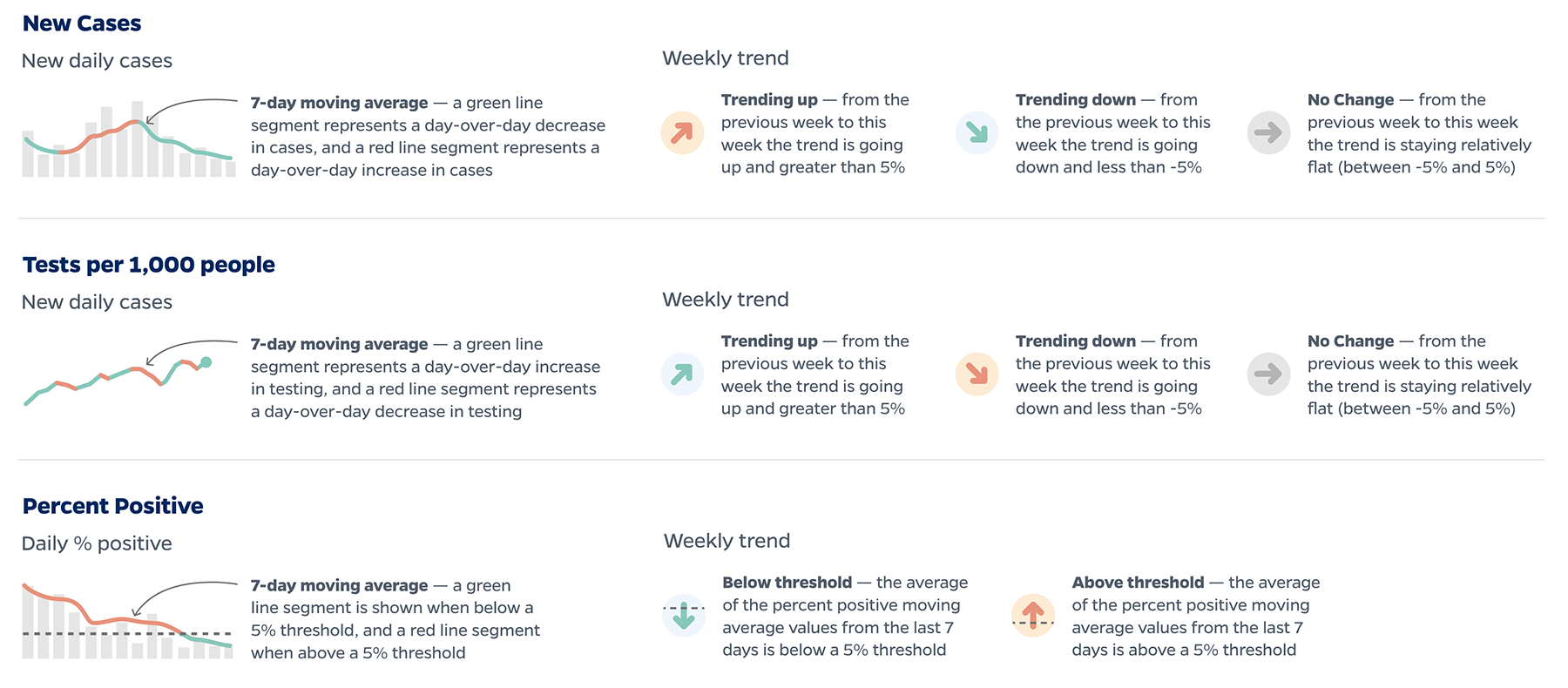
One of the persistent challenges of designing COVID-19 data visualizations is that a single metric only tells part of the story. To gain a better understanding on whether an outbreak is improving or worsening in a given state, the number of new cases should be looked at alongside how robust that state’s testing program is (tests performed per 1,000 people), and what percentage of those tests are positive. Due to the variability in states’ self-reported data, weekly trends and moving averages help to further clarify the current condition of an outbreak.
To aid in that type of overview, I designed a sortable, filterable table (image above) that displays all three metrics alongside each other, using small multiple charts displaying the most recent 14 days of data, as well as weekly trend icons that allow for a quicker, at-a-glance read.
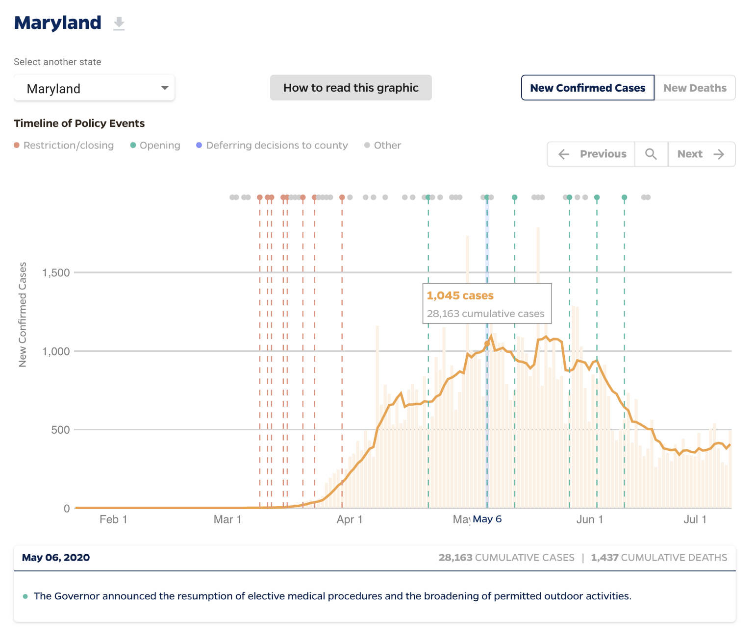
I also designed a tile map view, displays any of the metrics from the overview table, to identify regional trends:
The overview table is data-rich and invites careful exploration. To help users understand each of the chart components, we designed an explainer graphic that gives instructions on how to read each chart, and explains any calculations being made under the hood:
Other Projects:
Visualizing the History of FugaziData Visualization
COVID-19 Testing Trends TrackerData Visualization
Timeline of COVID Policies in the U.S.Data Visualization
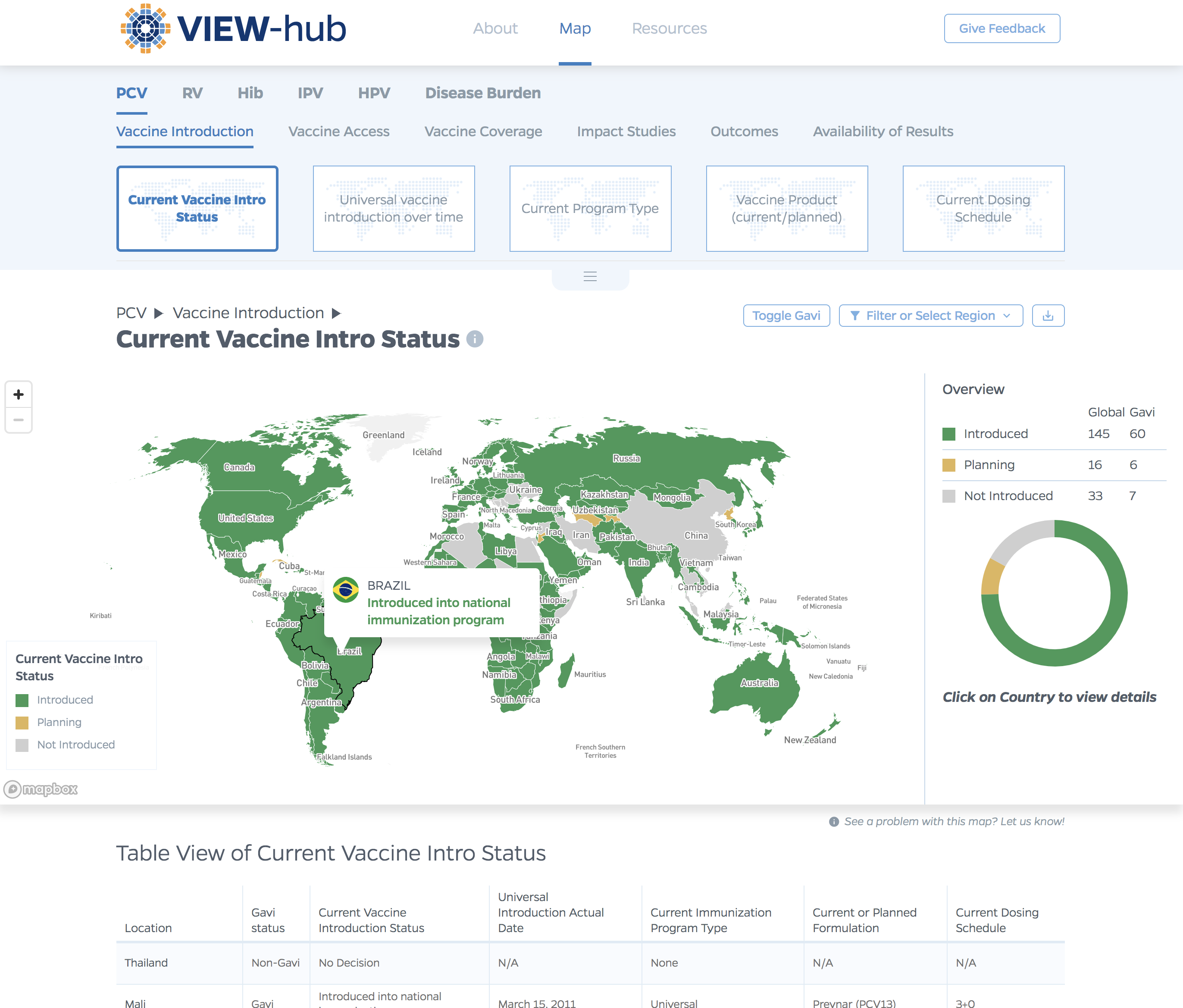
VIEW-hub website designUI/UX Design & Data Visualization
Transforming Food Systems Under Climate ChangeData Visualization & Report Design
Towards a More Equal CityData Visualization
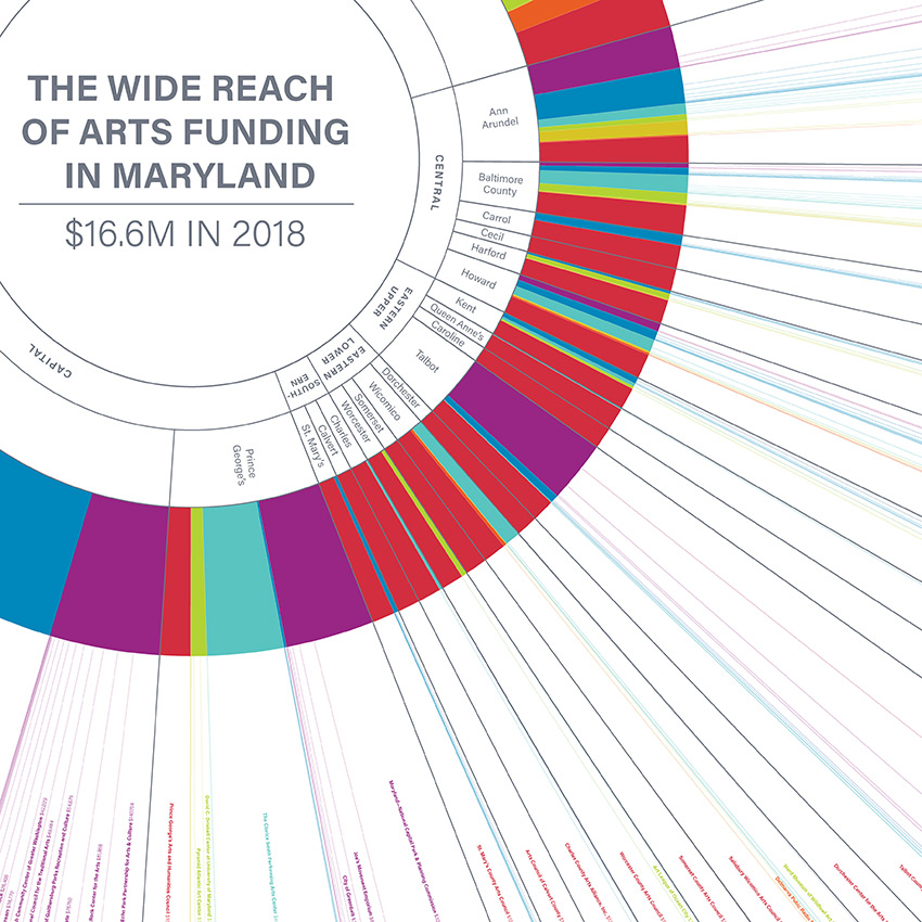
Wide Reach of Arts Funding in MarylandData Visualization
Creating a Sustainable Food FutureData Visualization & Report Design
Global Commission on AdaptationMap & Infographic Design
Logo & Branding projectsLogo design
Sensible Gun Laws NowInteractive
Stories to WatchPresentation Design
Globetrotting History of MetalData Visualization
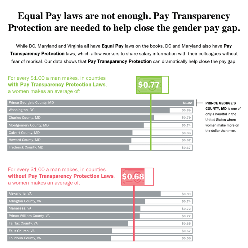
Equal Pay Laws are Not EnoughData Visualization

How to Record Your BandInfographic
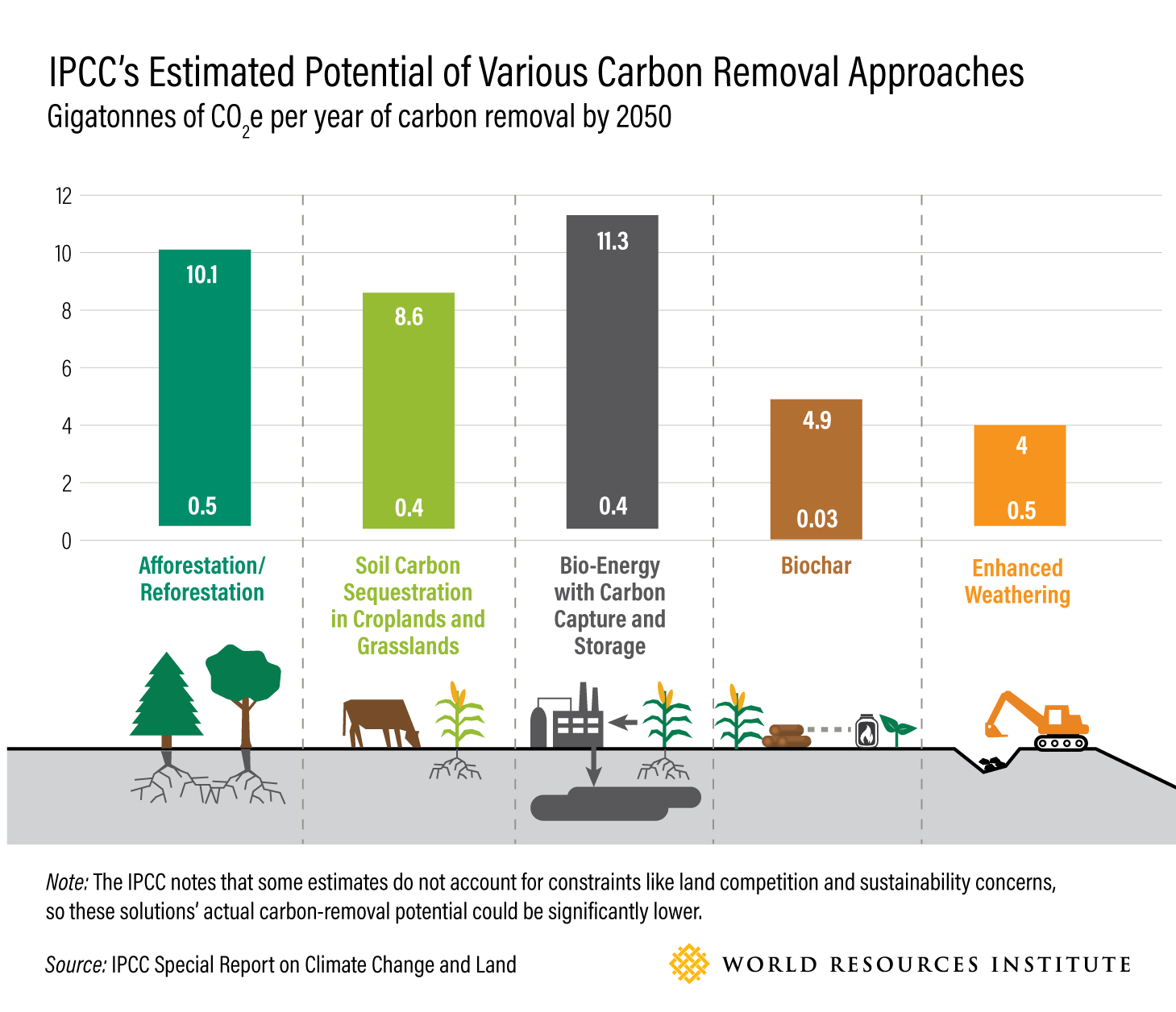
WRI Blog graphicsCharts & graphs
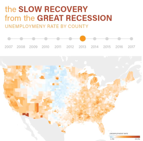
The Slow Recovery from the Great RecessionInteractive
The Race to the MoonInfographic
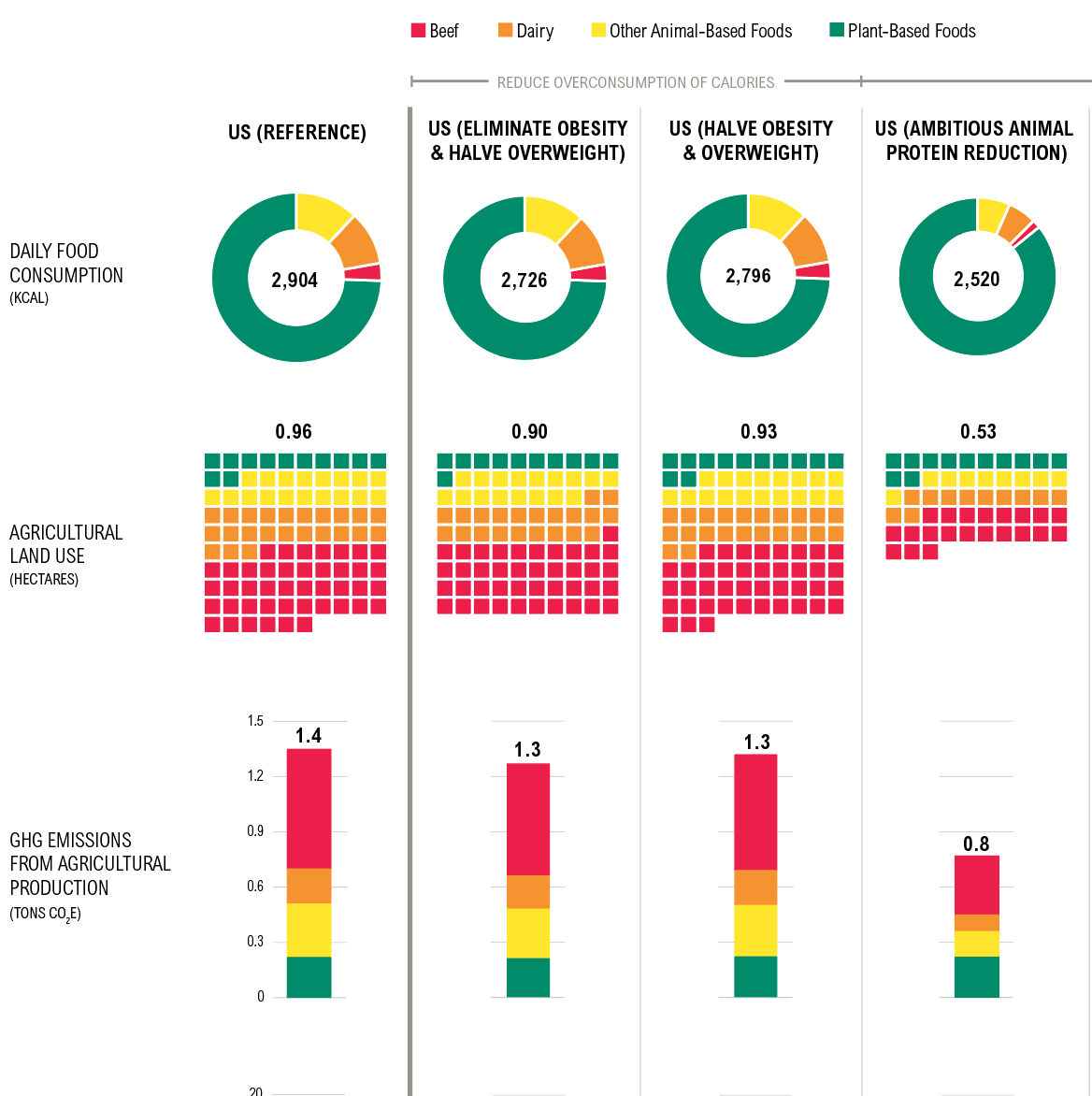
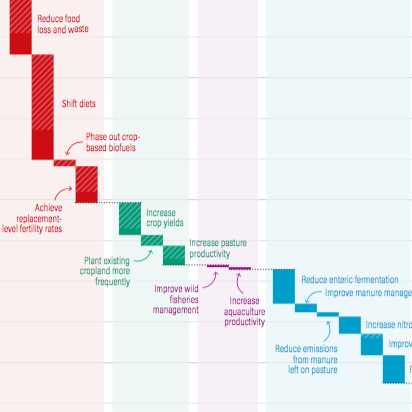
Shifting DietsData visualization
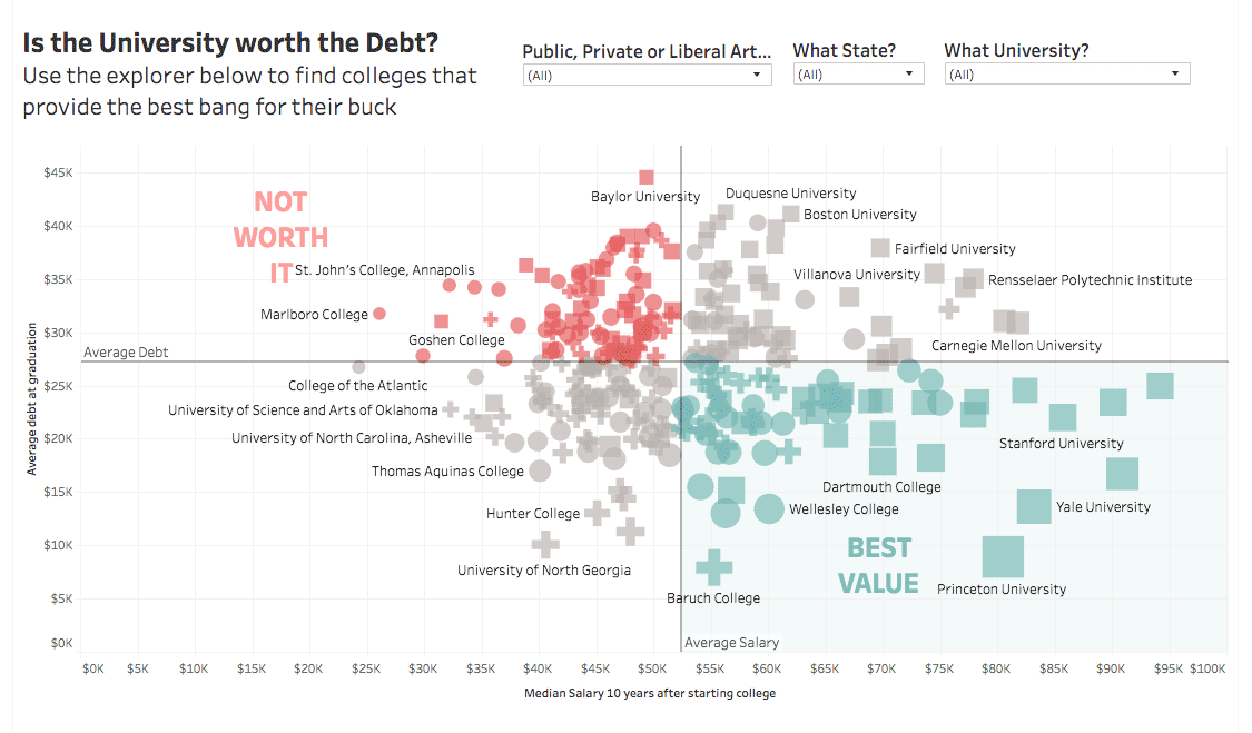
Is the University Worth the Debt?Interactive
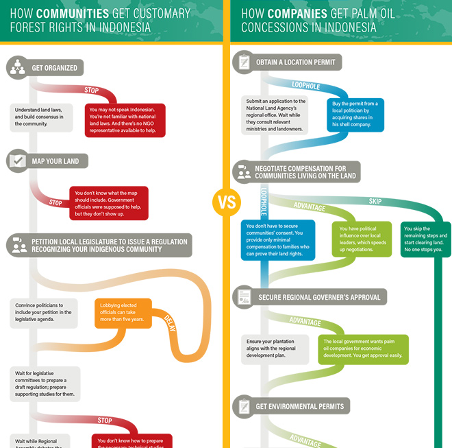
Scramble for Land RightsInfographic

Show FlyersConcert posters
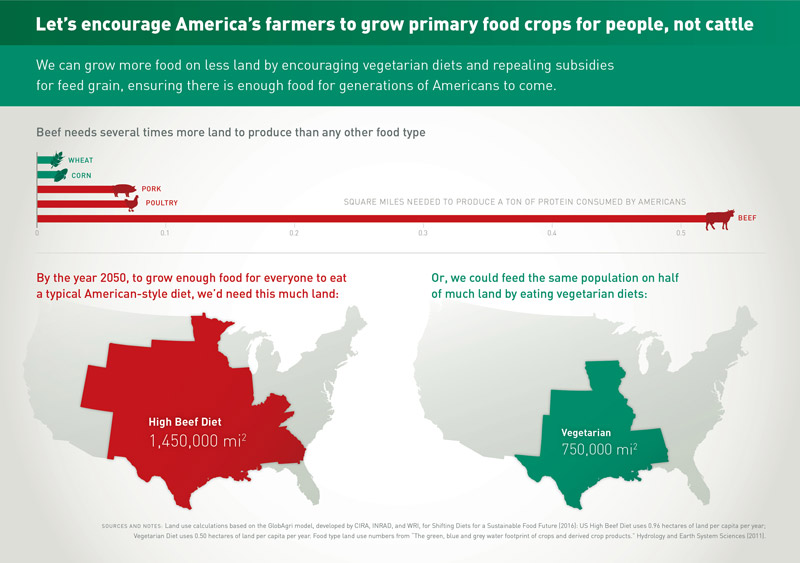
Land for Plants, not CattleInfographic
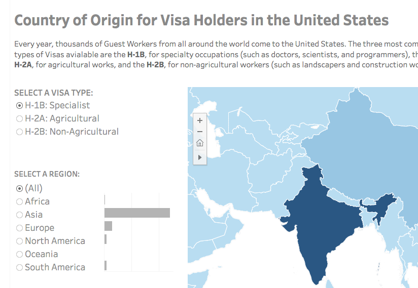
Visa Holders DashboardsInteractive
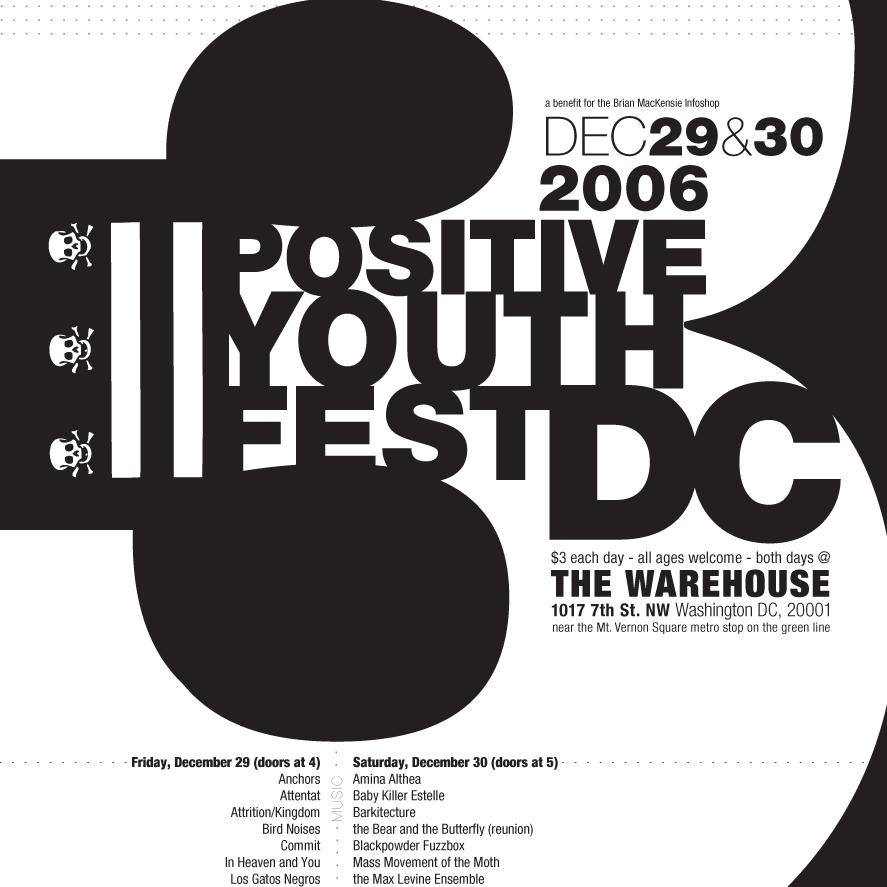
Positive Youth FestConcert Poster
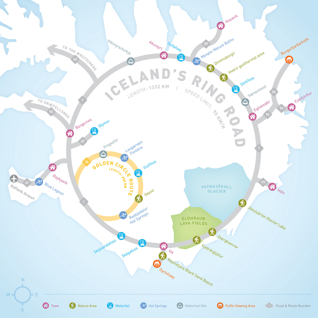
Iceland Ring Road MapInfographic
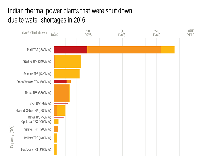
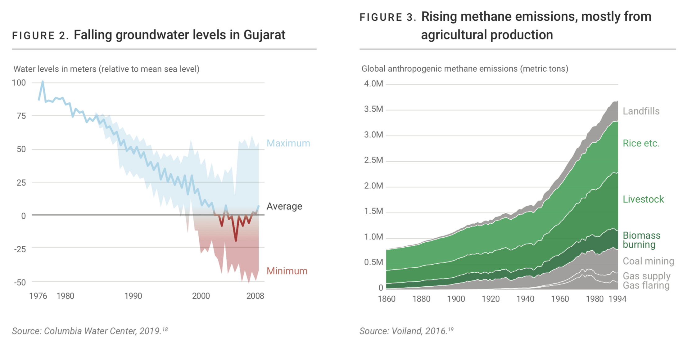
Droughts & BlackoutsData Visualization
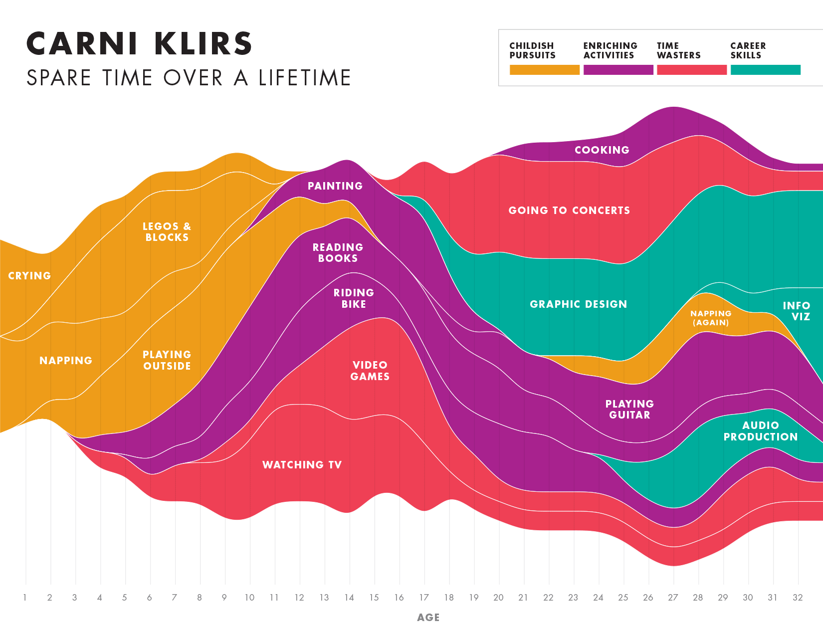
Spare Time over a LifetimeInfographic
Pinkwash posterConcert Poster
Please be in touch: carni.klirs@gmail.com. Follow me on instagram or twitter.