Shifting Diets for a Sustainable Food Future
DATA VISUALIZATION
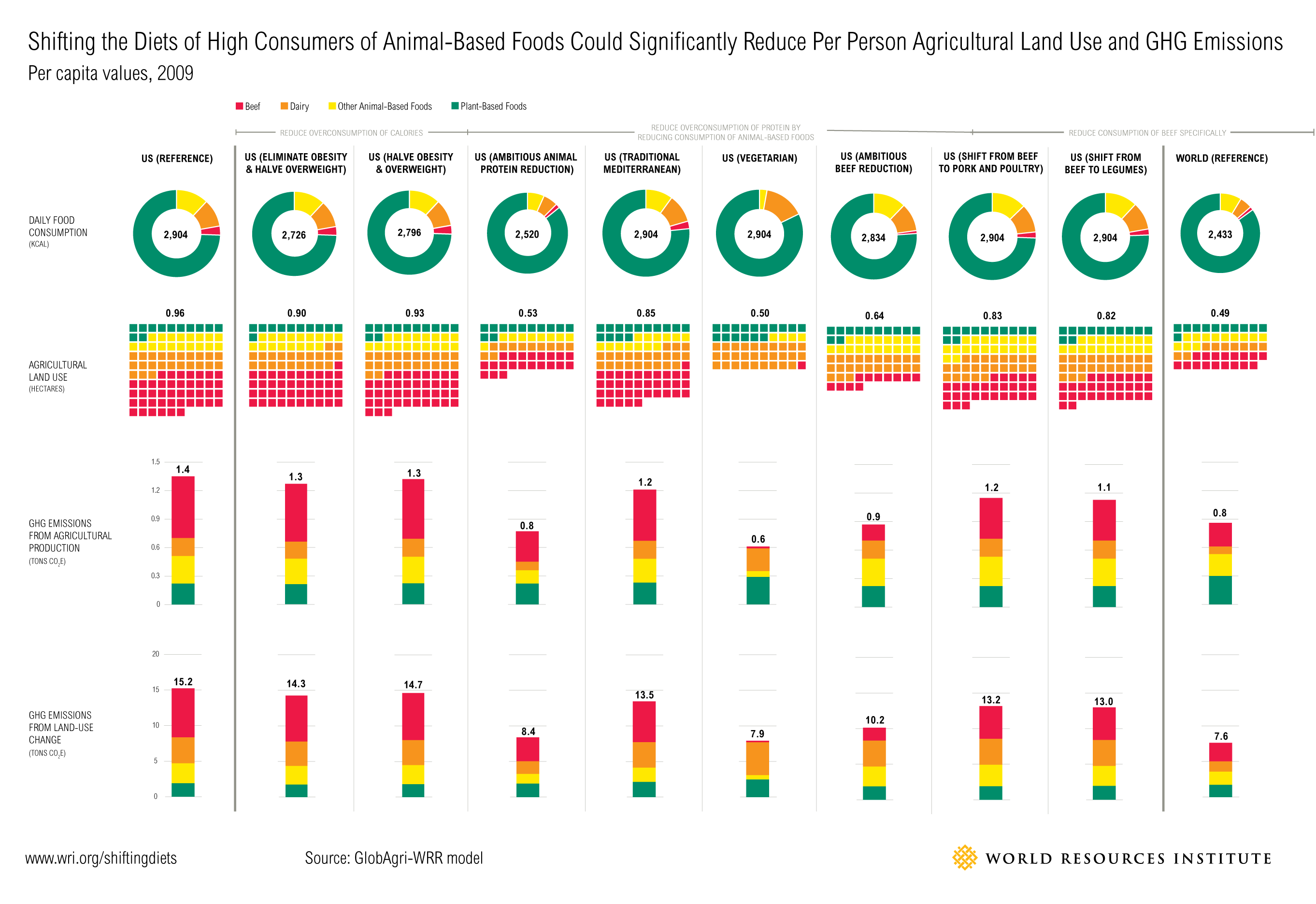
Installment 11 of Creating a Sustainable Food Future shows that for people who consume high amounts of meat and dairy, shifting to diets with a greater share of plant-based foods could significantly reduce agriculture’s pressure on the environment. The central figure of this paper is a large data visualization across a two page spread. It outlines the various diet types modeled by the authors. Each column represents a type of diet. The first row shows how much plant vs. animal protein comprises each diet. The next row shows how much land would be needed to support that diet, using the same color coding as the pie charts. The final two rows show greenhouse gas emissions. At a glance, the reader can see that while beef may be a small wedge in peoples diets, it has an outsized impact on land use and greenhouse gas emissions.
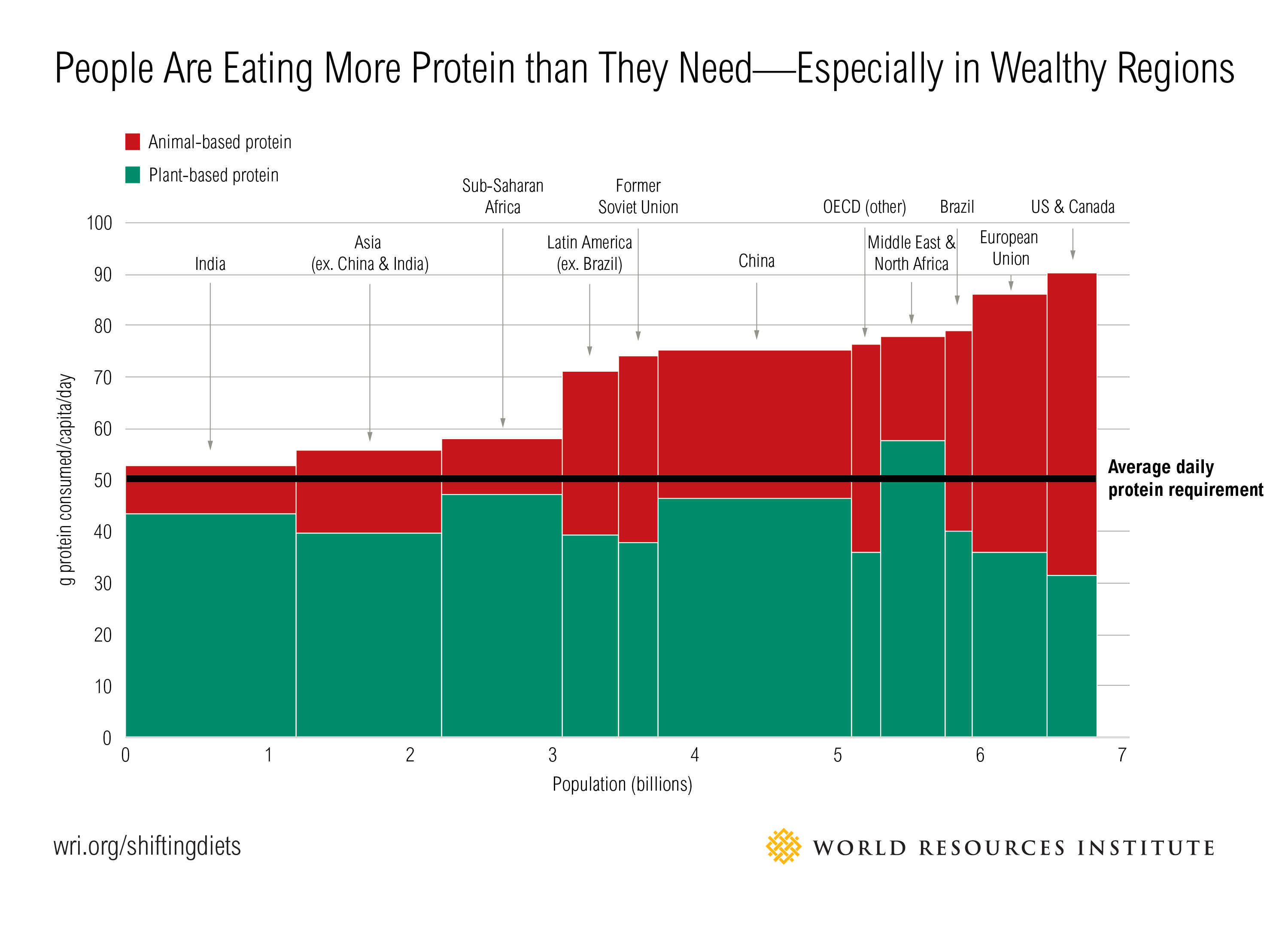
Each chart in the paper helps to build a case for eating less animal-based protein. One of the more compelling things I learned while designing this paper was the next chart, which shows that everyone in the world can get almost all of their daily protein requirement just from plant-based sources. Many people, especially in wealthier countries, eat more protein than they need.
Other Projects:
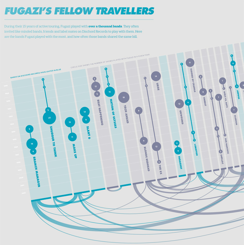
Visualizing the History of FugaziData Visualization
COVID-19 Testing Trends TrackerData Visualization
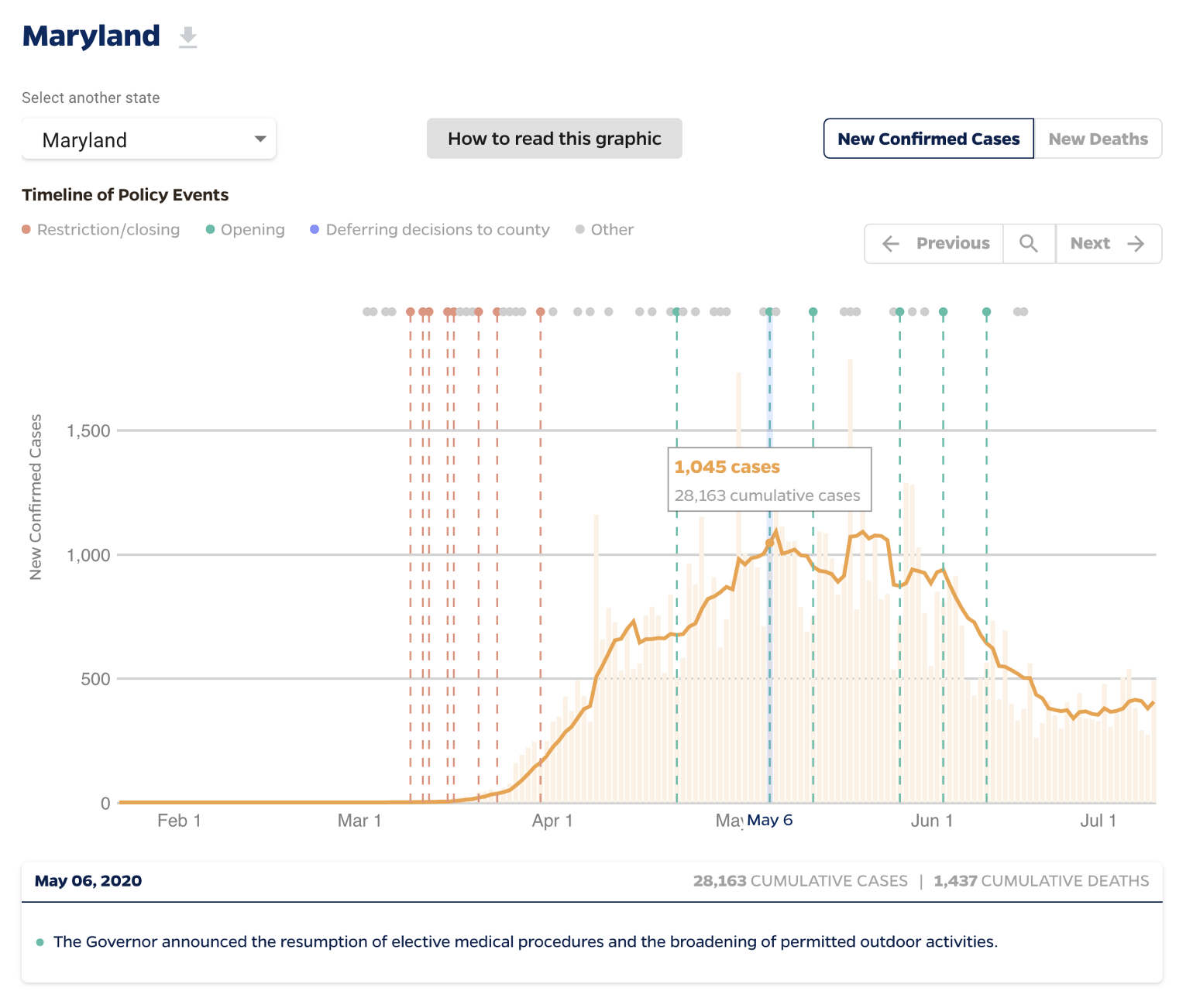
Timeline of COVID Policies in the U.S.Data Visualization
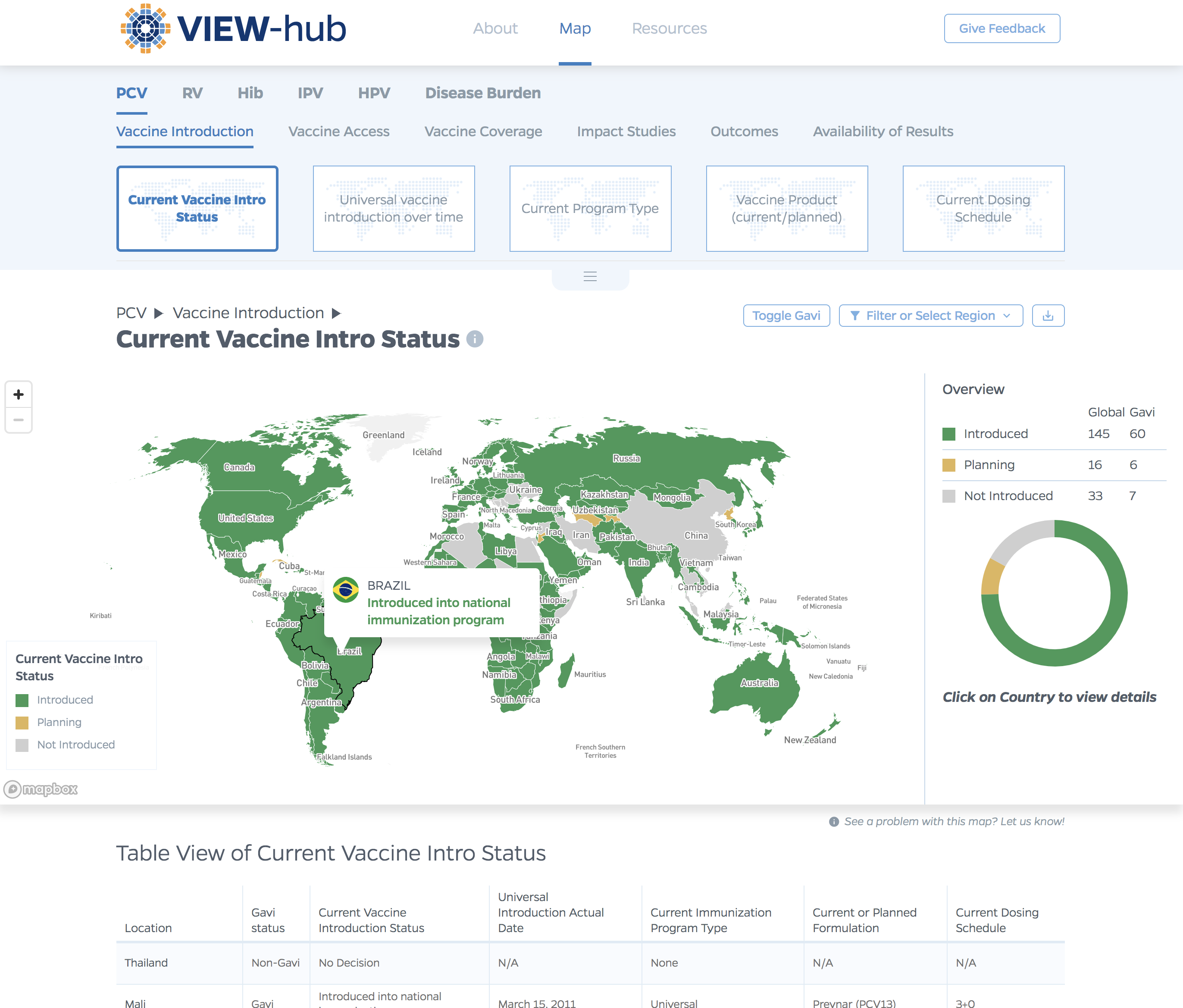
VIEW-hub website designUI/UX Design & Data Visualization
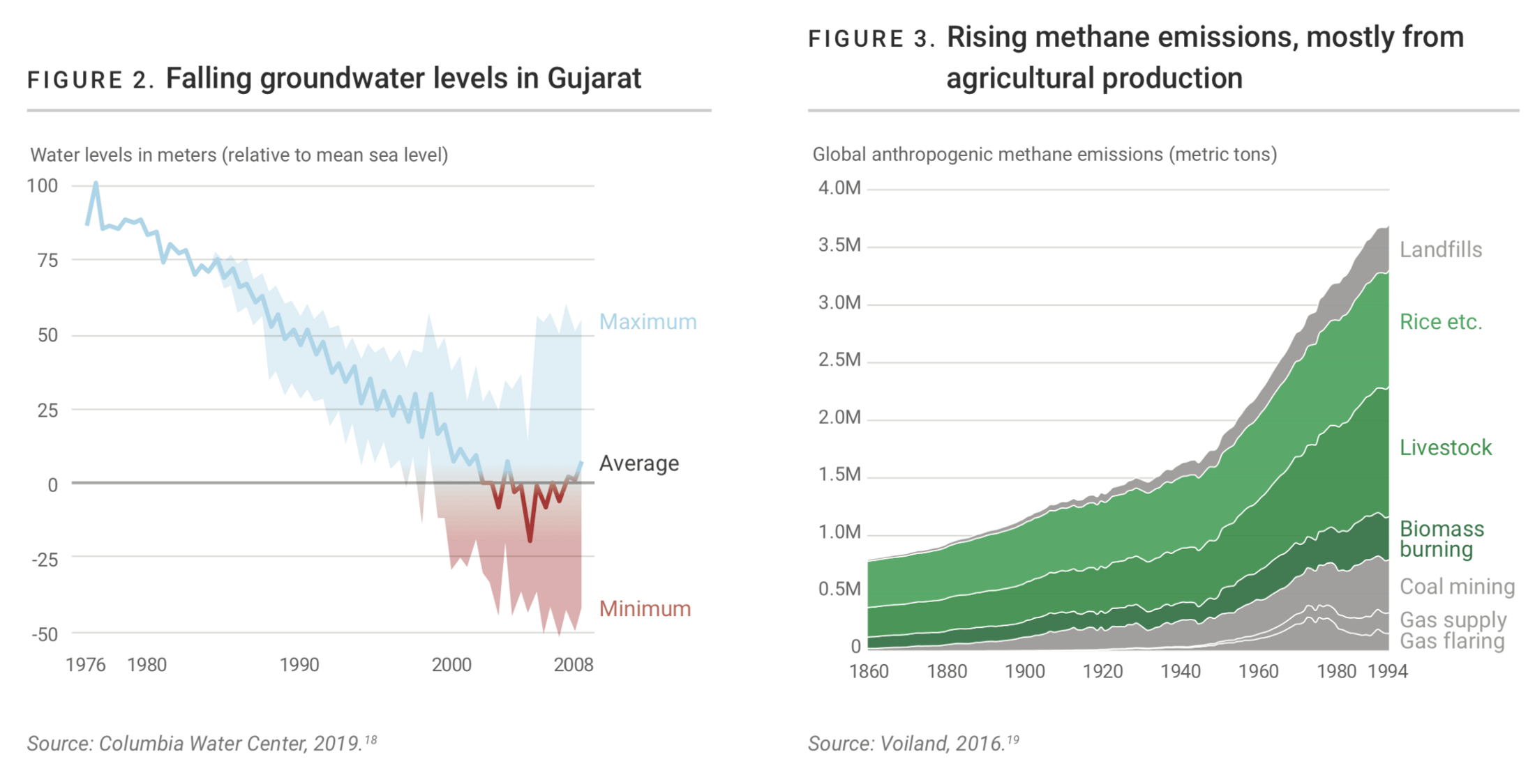
Transforming Food Systems Under Climate ChangeData Visualization & Report Design
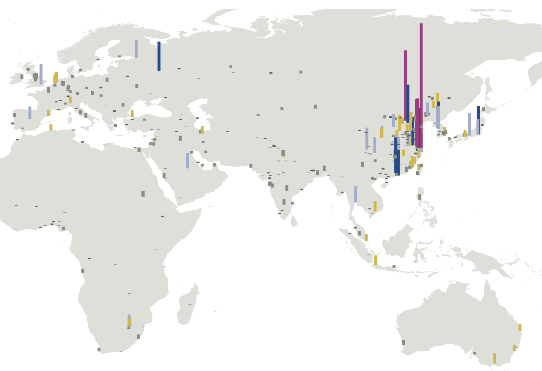
Towards a More Equal CityData Visualization
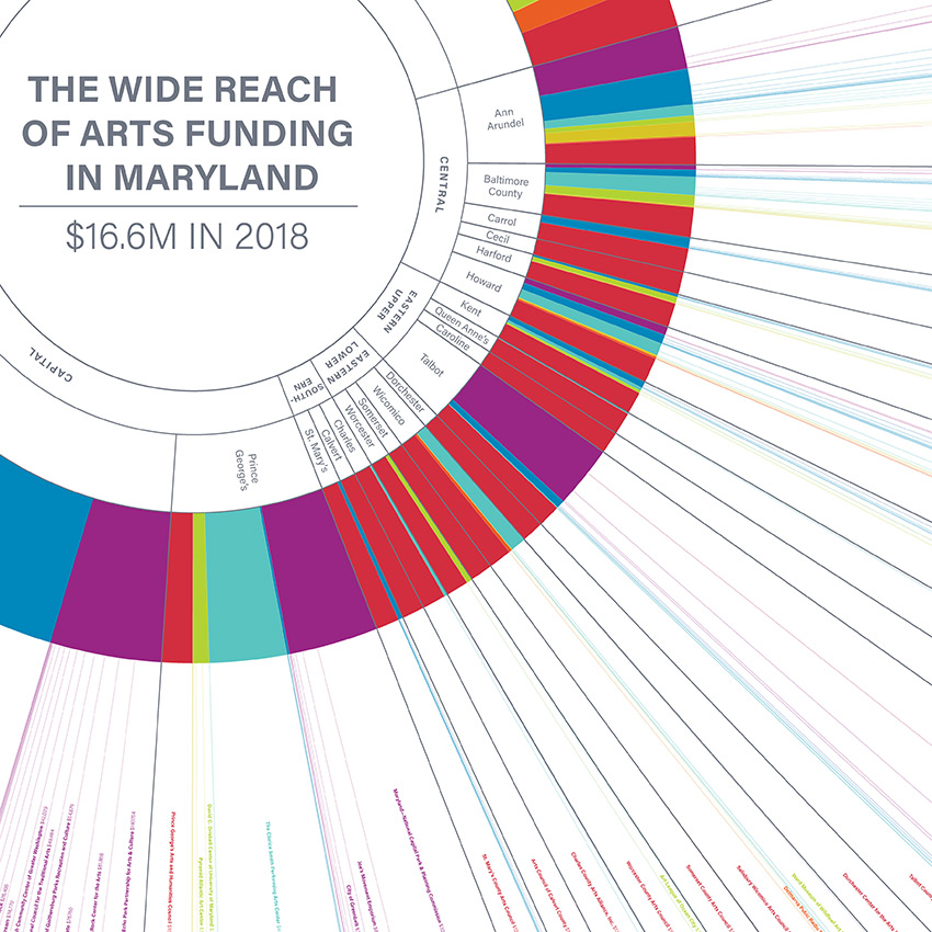
Wide Reach of Arts Funding in MarylandData Visualization
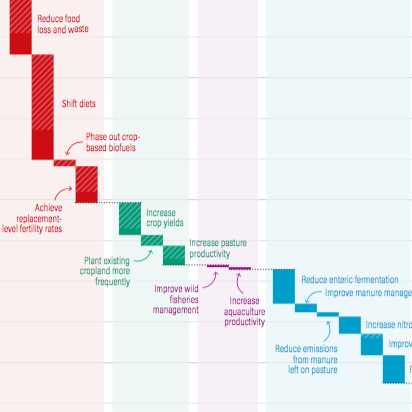
Creating a Sustainable Food FutureData Visualization & Report Design
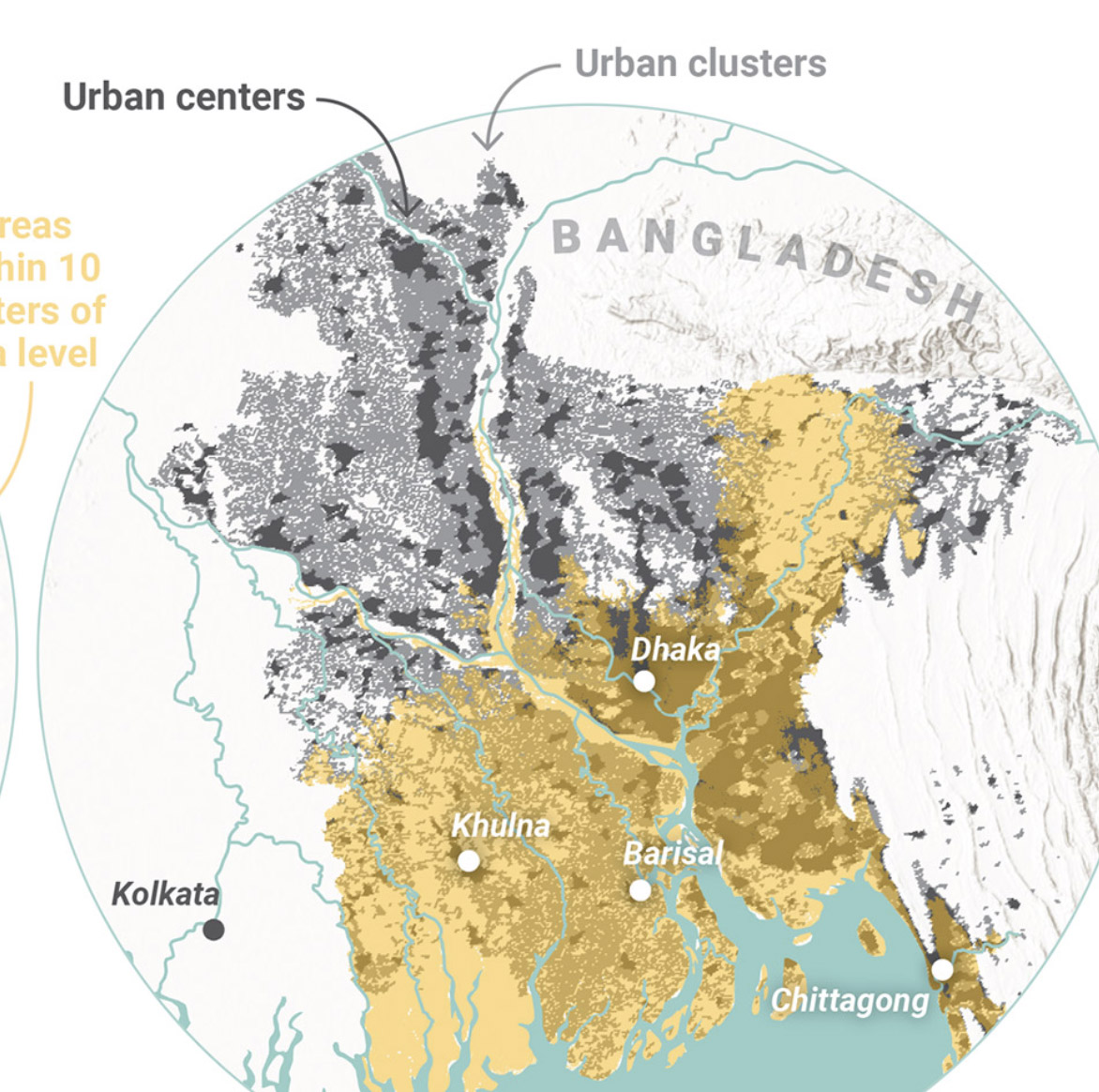
Global Commission on AdaptationMap & Infographic Design
Logo & Branding projectsLogo design
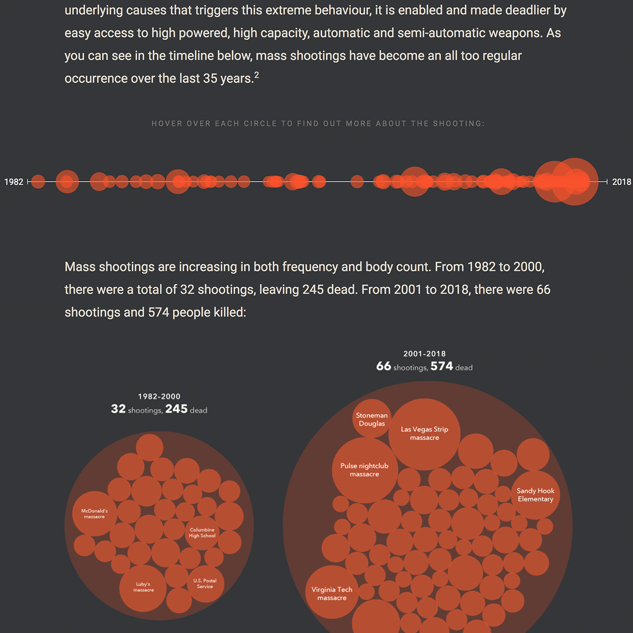
Sensible Gun Laws NowInteractive
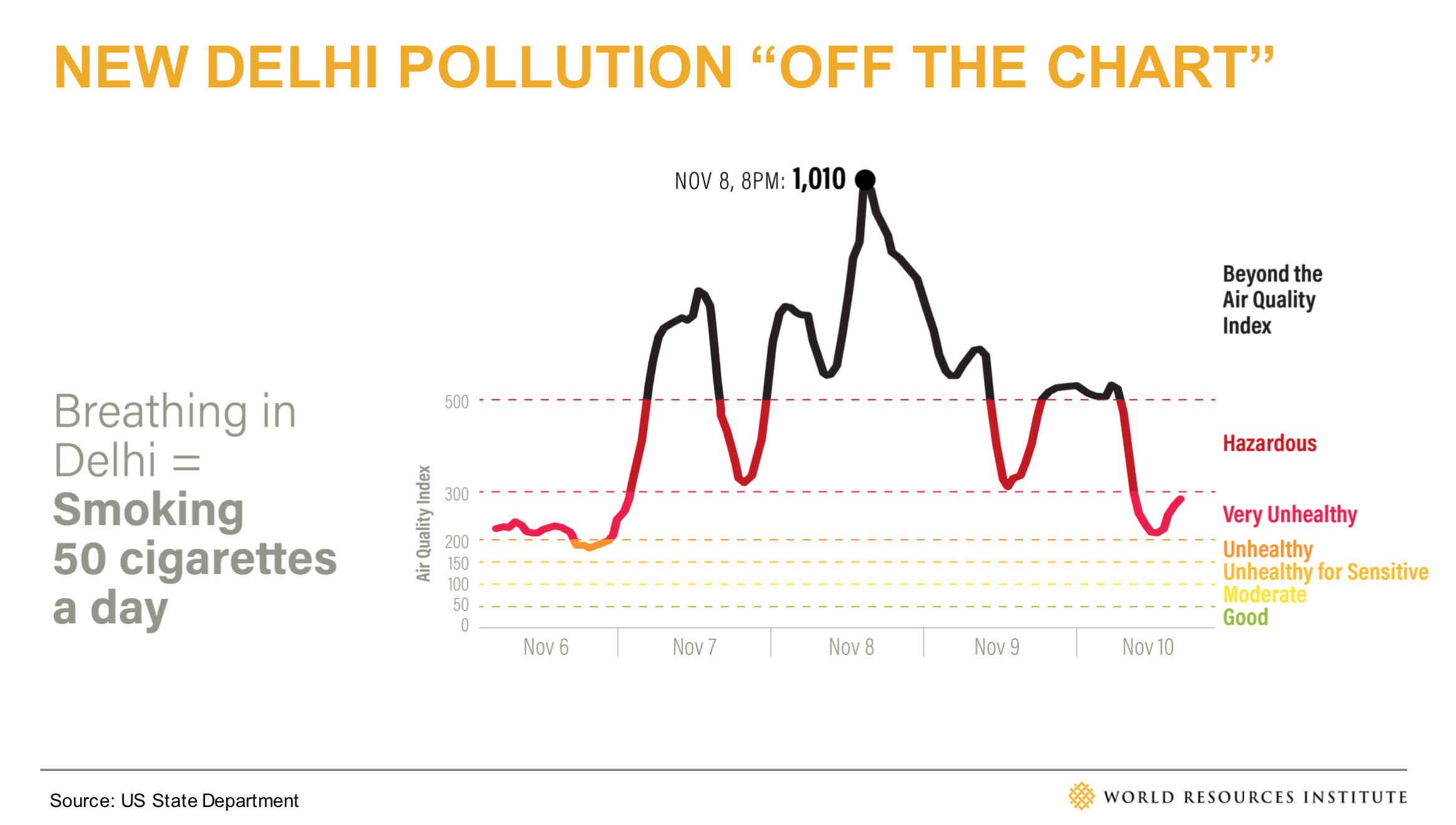
Stories to WatchPresentation Design
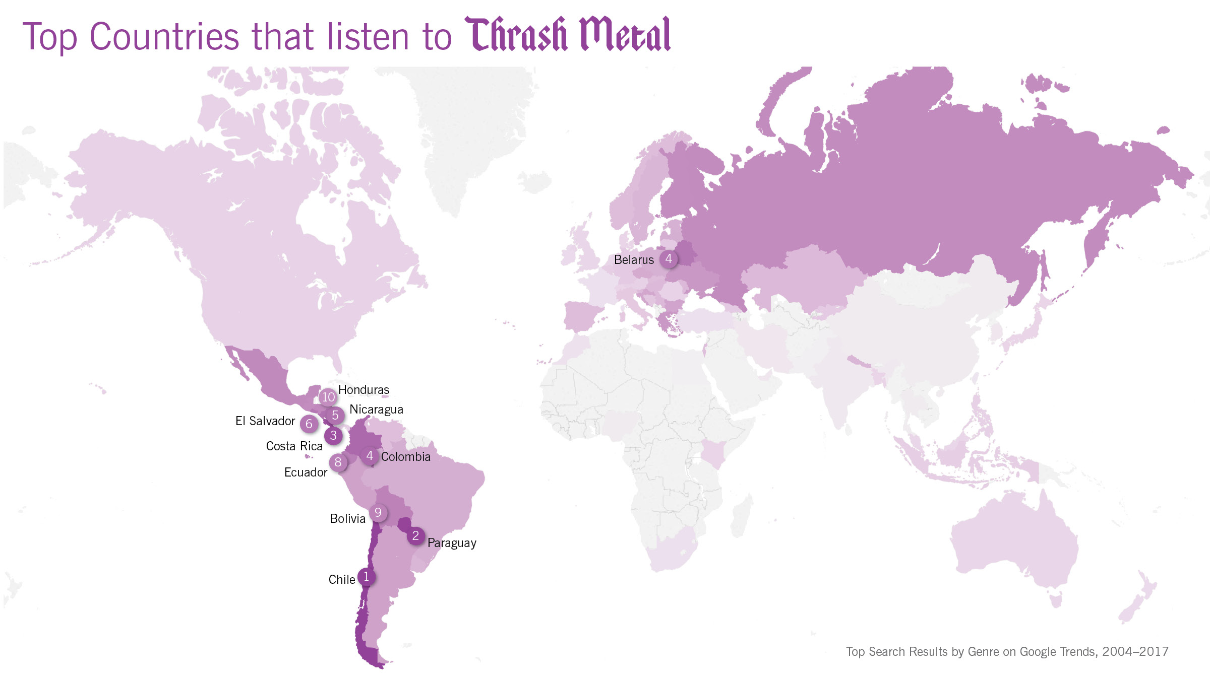
Globetrotting History of MetalData Visualization
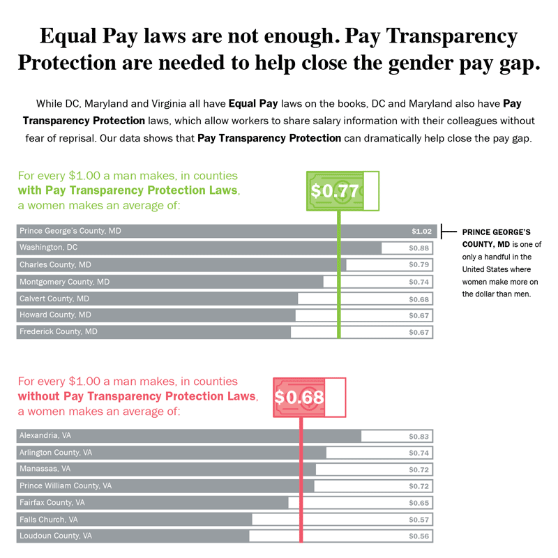
Equal Pay Laws are Not EnoughData Visualization

How to Record Your BandInfographic
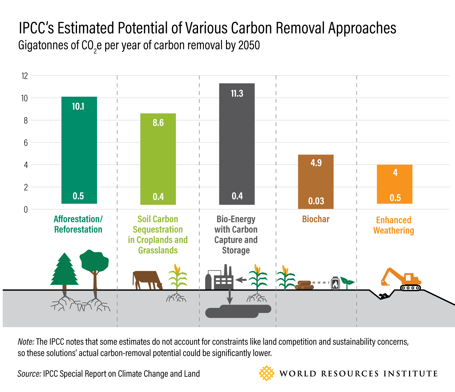
WRI Blog graphicsCharts & graphs
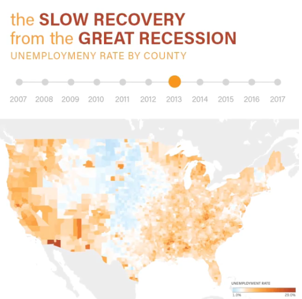
The Slow Recovery from the Great RecessionInteractive
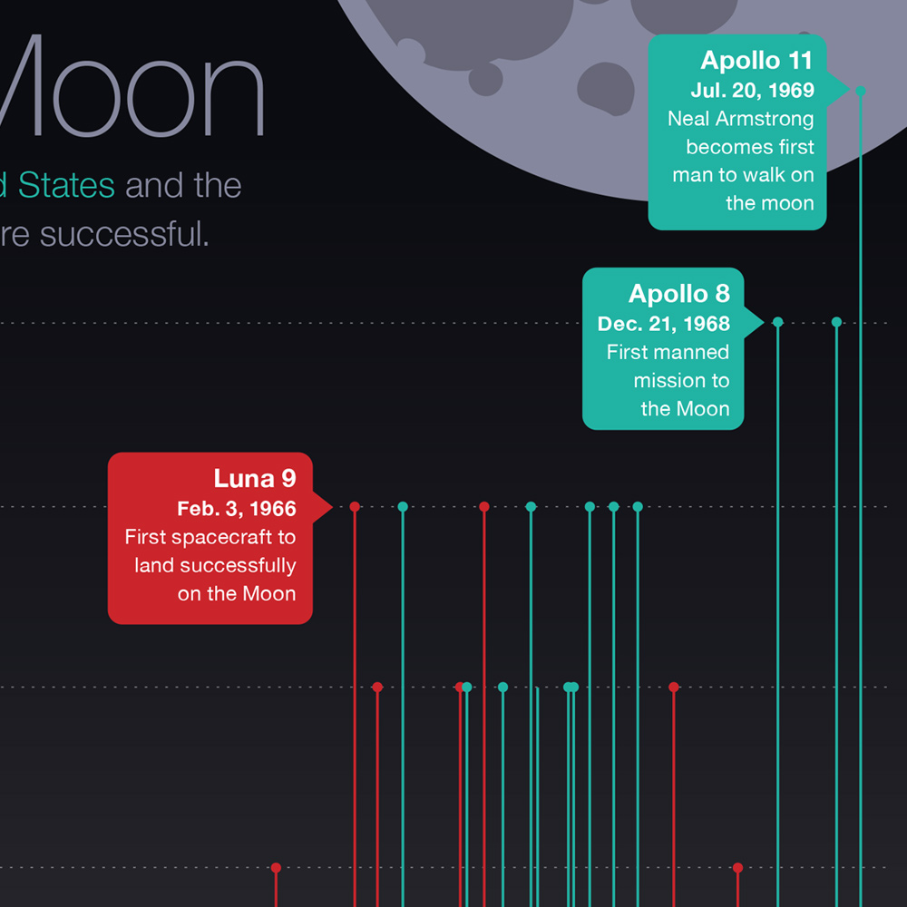
The Race to the MoonInfographic
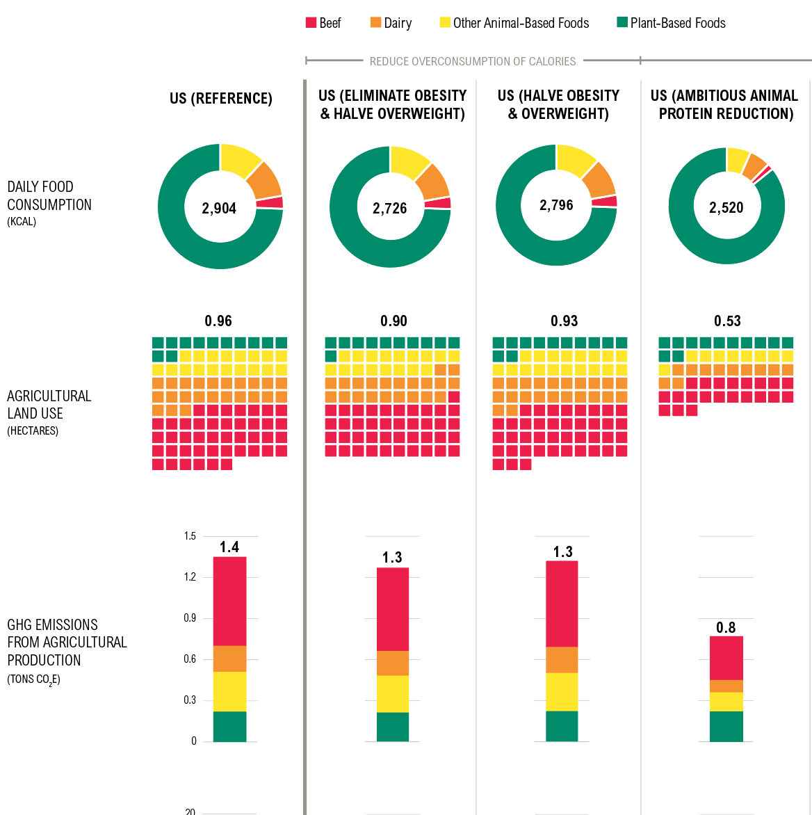
Shifting DietsData visualization
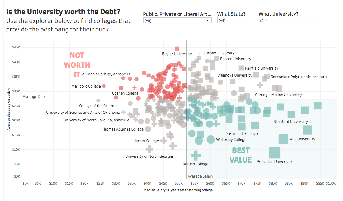
Is the University Worth the Debt?Interactive
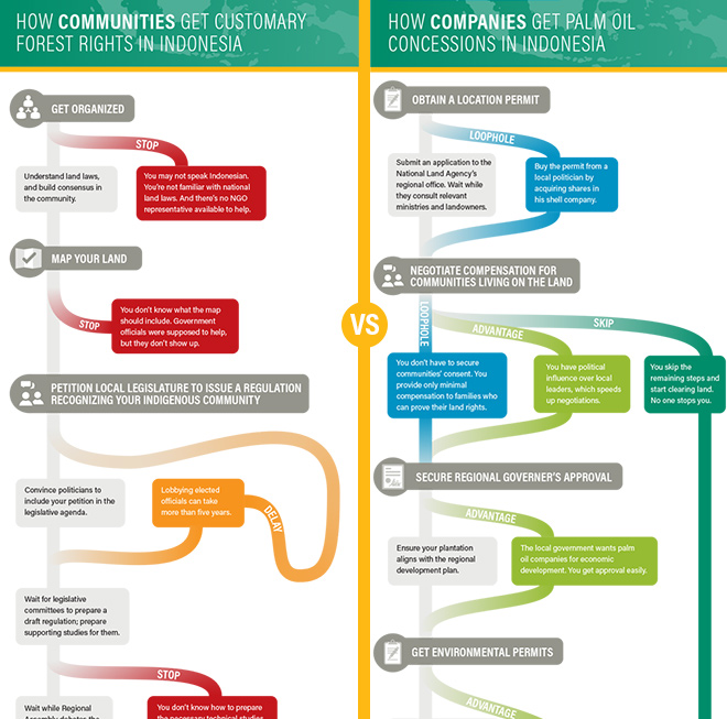
Scramble for Land RightsInfographic

Show FlyersConcert posters
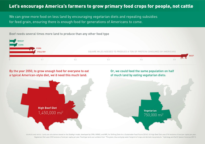
Land for Plants, not CattleInfographic
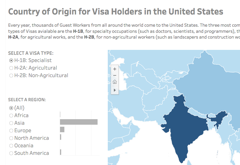
Visa Holders DashboardsInteractive
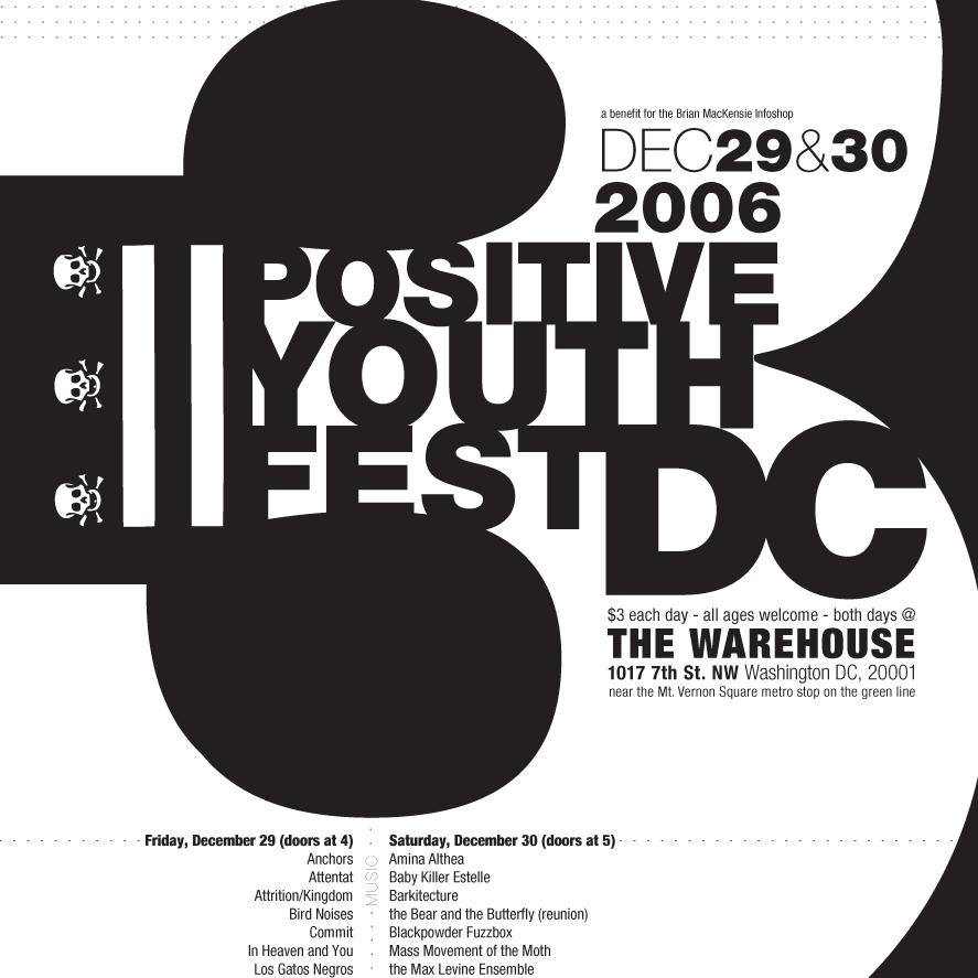
Positive Youth FestConcert Poster
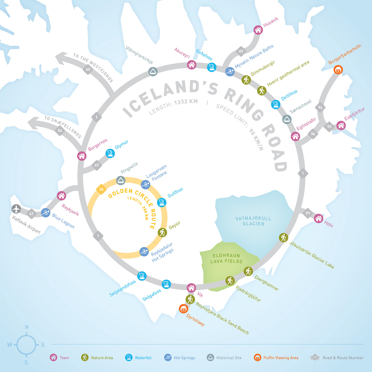
Iceland Ring Road MapInfographic
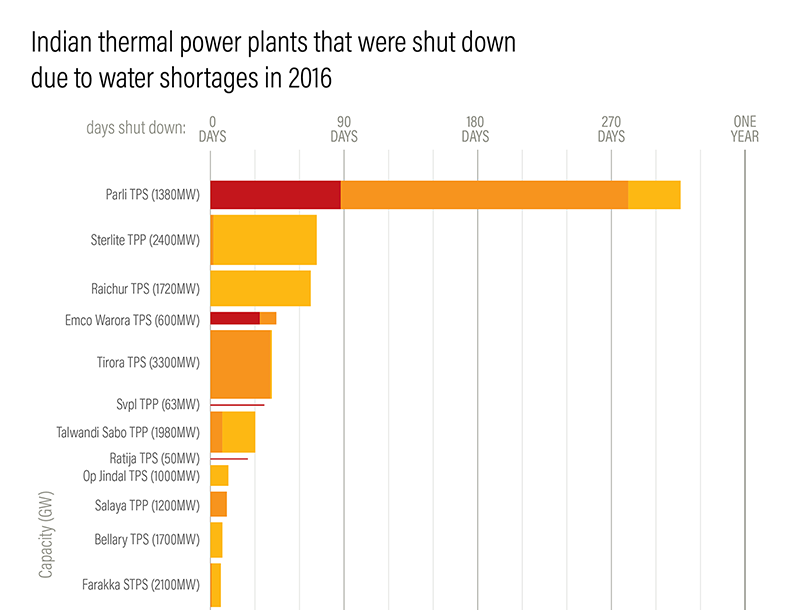
Droughts & BlackoutsData Visualization
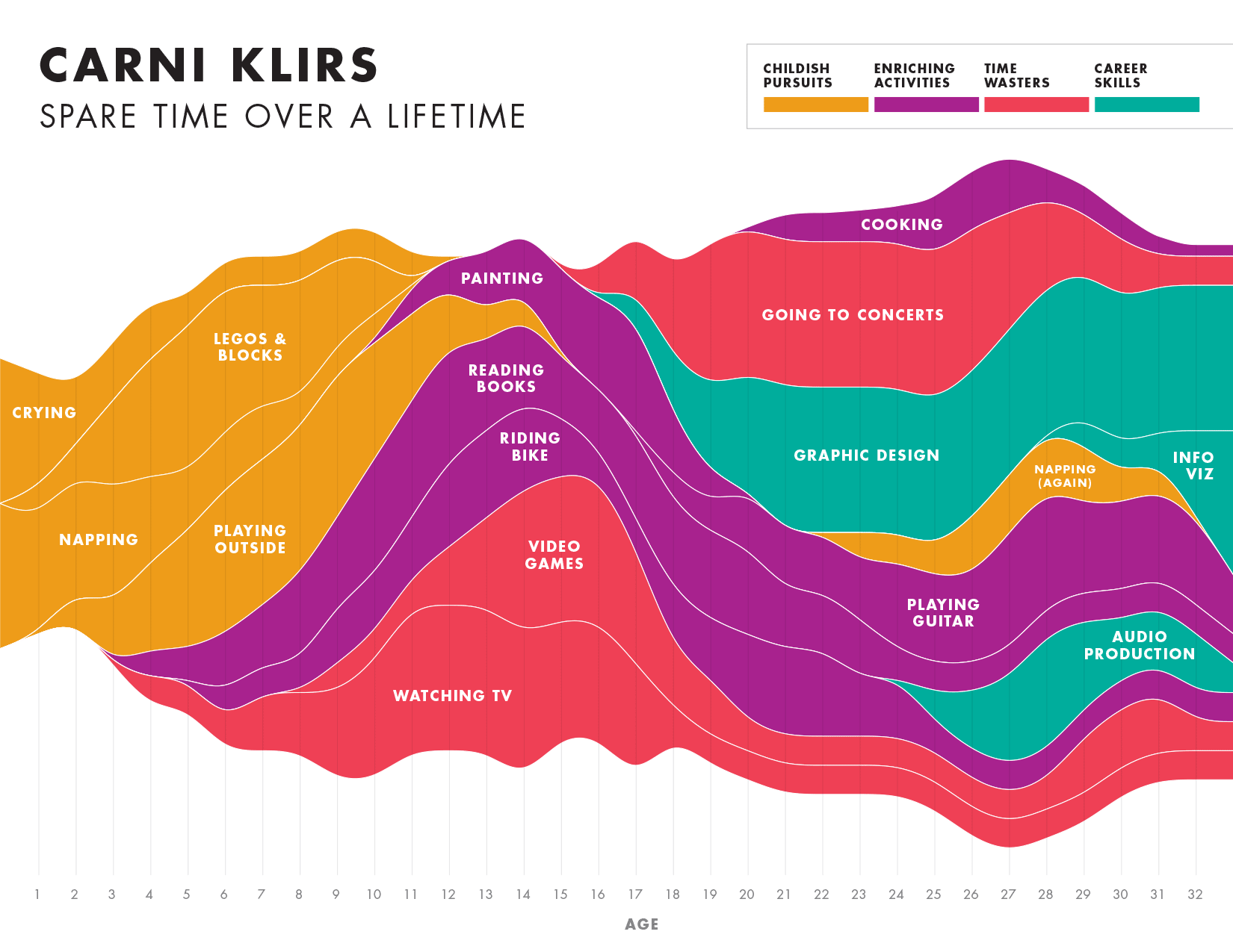
Spare Time over a LifetimeInfographic
Pinkwash posterConcert Poster
Please be in touch: carni.klirs@gmail.com. Follow me on instagram or twitter.
